
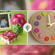
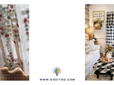
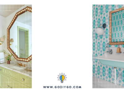
When it comes to an interior design portfolio is typically a presentation, which designers bring up during home visits and consultation meetings. Portfolio development is crucial, as your clients need to see some form of evidence of your taste and design skills.
Using various fonts in your design portfolio allows you to show your style and express your ideas. The font seems to be such a small a simple thing however it provides the readability and uniqueness of your portfolio.
To highlight the unique touch of the recent projects you’ve been working on, you can use handwritten serif fonts. Fonts can convey a wide variety of attitudes and personalities. Here is a list of the seven best fonts to consider using in your professional portfolio.
1. Open Sans
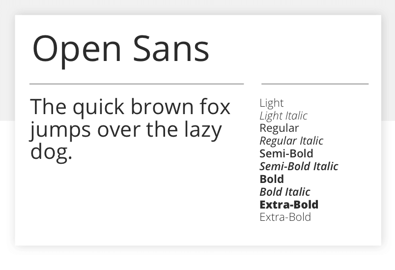
Open Sans has a clean and modern overall look which makes content readable due to its simplicity. You can clearly read it in small sizes as well as use it for printing huge billboard letters.
Open Sans was designed by Steve Matteson, Type Director at Ascender Corp, and classified as being a humanist sans serif typeface. Open Sans is not only great to use in an interior design portfolio but also across print, web, and mobile interfaces.
2. Montserrat
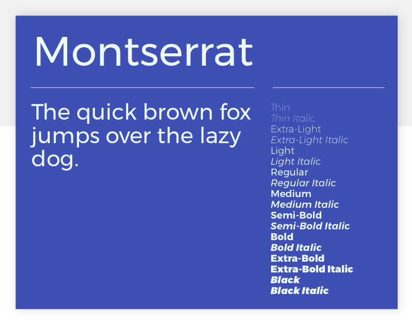
Montserrat is an open-source geometric sans serif typeface design that was designed in 2010 by Julieta Ulanovsky. She was inspired by the lettering of her neighborhood back in Buenos Aires, Argentina.
The neighborhood was from where she collected letterforms and glyphs that looked the most unique. In the making of the typeface project, she hoped to “rescue the beauty of urban typography from the first half of the twentieth century”.
Considering the inspiration of the font which was collected from street signs, posters in Julieta’s old neighborhood, this font is mostly used for navigation signs. The uppercase form of Montserrat font works very well in various cases including portfolio headings.
3. Futura
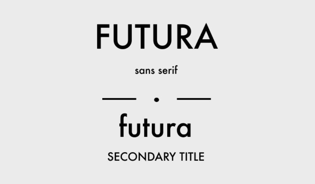
Futura is one of the most popular web fonts used for all sorts of portfolios and projects. It’s often used for body text, as well as bold titles. The overall look is based on geometric shapes which presents it with a modern and natural feel. The font is extensively used in logos and advertisements, notably by Supreme and Volkswagen.
Futura is a geometric sans-serif typeface designed back in 1927 by Paul Renner. Inspired by the aesthetic of the Bauhaus school in favor of simple geometric forms: near-perfect circles, triangles, and squares.
4. Calluna

Calluna is a serif typeface released in 2009 and created by Dutch designer Jos Buivenga. The font was made more or less on an accident. Jos was in the process of creating another font when he decided to give himself a break and play around. In the end, it all came down to Calluna’s classic typeface design.
Calluna has more of a flowing and calligraphic feel. The precise lines of this serif make it nice, stylish, and more assertive. Many call it a modern alternative to old-style font types. Calluna comes in 8 different weights: light, regular, regular italic, semibold italic, bold italic, and black.
5. Playfair Display
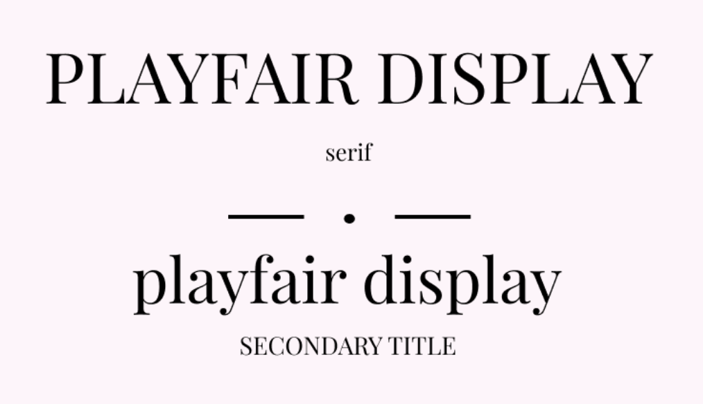
Playfair Display is best suited for headlines and titles. It’s part of the classic serif font family meaning it can be paired with many of the sans serif fonts. The weight of the text comes in regular, black, and bold.
The capitals of this font are extra short, and only slightly heavier than the lowercase characters. This helps achieve a more even typographical color when typesetting proper nouns.
Designed in 2011 by Danish type designer Claus Eggers Sorensen, the design was influenced by the eighteenth century. When nib quills were replaced by pointed steel pens and technologies made it possible to print letterforms of high contrast.
6. Titillium

Titillium has quite diverse characteristics because of its adaptable appearance and ten weights. The black and bold styles are solid but give a hint of playfulness. Unlike the regular and light forms which are elegant and stylish.
Titillium font was designed inside the Accademia di Belle Arti di Urbino. Three years after the birth of the project it’s still being developed, every year a dozen of students work on the project further.
The future of the project is unknown but at the moment it offers ten weights: regular, italic, medium italic, medium, semibold, semi formidable italic, ambitious, formidable italic, variable, and variable italic.
7. Roboto
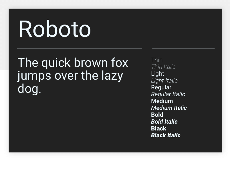
Roboto is often a popular choice that many interior designers use for their portfolios. It’s a very diverse font and it works well in headers as well as body text. The main advantage of it is that it can be easily paired with many other fonts.
Roboto has open curves which give it a friendly look but at the same time, it’s technical due to its geometrics. The natural width letterforms of this font make for a more natural reading rhythm, which is why many use this font for portfolios.
First released in 2011, Roboto was designed by Christian Robertson to replace the old Google system font for Android. It’s available in four weights: thin, light, regular, and bold. In 2014 it was revised, the most striking differences in the revision include round dots and round glyphs without straight segments.
Conclusion
These are just a handful of the great fonts that can be used to showcase your work in an interior design portfolio. Various creative fonts help you to add a unique feeling to your portfolio that helps to stand out from others. They give little hints about the content they represent like your personality, the project’s main idea, or the vibe you want to portray.
It can take some time to play around with fonts to decide which one will work best with your style or project. With well-selected fonts in your portfolio, you can demonstrate your professionalism and amazing style to your potential clients, which will get more people interested in your services.


